Kerning refers to the process of adjusting the space between letters in typesetting and graphic design.
The word originally comes from the French carne, meaning projecting angle or quill of a pen. In the days of manual typesetting, letters were placed on individual metal blocks known as glyphs. If a letter overlapped the following letter (e.g. a capital T before a capital A), the overlapping parts (the bars of the T), would protrude over the edge of the glyph, and these exposed parts of the letter were known as kerns.
You might not think kerning is important, especially because most digital text is automatically kerned for your pleasure. Here’s a nice example from Wikipedia of the benefits of kerning:

See how bringing the A and V together so they overlap makes it look much better? To contrast, look at the following sign:
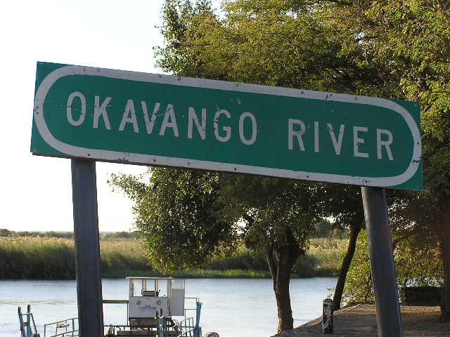
See how the AVA fit together well, but this sets them apart from the rest of the name? This could use some kerning to bring the other letters closer together.
You’ll probably never need to use the word kerning, but it’s nice to know a little bit about what goes on behind the scenes of writing, the subtle magic that happens to help us read smoothly, and keep the world turning. And if you’re ever designing a sign, now you might be a little more conscious of your kerning, lest you end up like the poor people involved in these examples of bad kerning.

Well, there you go Niall, something else you have taught me. I had never even heard of this word, and your right, it does make me think of what I take for granted when simply reading.
LikeLiked by 1 person
I only heard of it recently, but now I always notice when it’s done badly 😊
LikeLike
Your posts are always so informative! I feel like I’m going to be watching for crowded letters from now on 😆
LikeLiked by 1 person
You’ll spot them everywhere now 😊
LikeLike
You always teach me something new about language! And yes, often I forget… but from now on, whenever I hear the word ‘kerning’ I’ll think ‘OMG, I know… wait for it… just let me think’ 😀
LikeLiked by 1 person
At least you’ll be able to notice examples of bad kerning to help you remember 😊
LikeLike
I learned a new word today! Thank you 🙂
LikeLiked by 1 person
My pleasure 😊
LikeLike
Another blog post another new word that i had no idea about! Thanks for sharing x
LikeLiked by 1 person
My pleasure, I discovered the word fairly recently and had to share it 😊
LikeLiked by 1 person
I love to learn more about the subtle magic present in our world & when it concerns words, even better!
LikeLike
It is something so simple that you can easily overlook, or not even consider but in reality it does make the words look much better!
LikeLiked by 1 person
Absolutely, now that I’m aware of it I notice it when it’s either done well or badly. Even on the rare occasion I find myself handwriting, I’m conscious of it.
LikeLiked by 1 person
How interesting… You are right when you say that Kerning seems outdated given the digital text and the consequent “automatically kerned letters”… However as the River sign in your post shows there could be still issues and incongruences!. Thank you for the informative post, dear Niall. Love & best wishes 😀
LikeLike
[…] quite put my finger on why though. It certain looked too long (and that might have been due to the kerning), but every letter seemed to be in the right […]
LikeLike